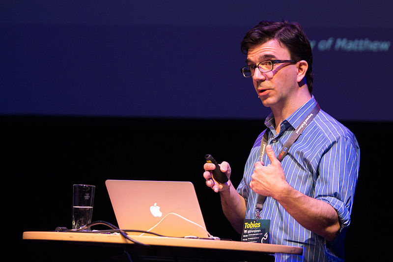


Tobias Frere-Jones is an American type designer from New York City, born in 1970. He received a BFA from the Rhode Island School of Design, then worked in Boston for the Font Bureau for seven years. Afterwards, he went to the Yale School of Art to serve as a critic, then went to work with Jonathan Hoefler at the Hoefler and Frere-Jones type foundry. But after some internal conflict and splitting, Frere-Jones made his own foundry called Frere-Jones Type, situated in Brooklyn.
Visit his type foundry here.
The Gotham typeface was originally commissioned by GQ Magazine, and Frere-Jones was a part of the efforts in making it. Gotham was inspired by mid-20th century signage found in NYC, but Frere-Jones specifically was interested in the Port Authority Bus Terminal. He took inspiration from Futura as well, and sought to make this typeface more on the geometric side. His goal was to make this font “fresh and masculine.” Gotham wasn’t originally available to the public until after 2002 when GQ’s license expired. Since then, many companies have used Gotham for their logos, including but not limited to: Saturday Night Live, Taco Bell, and even Spotify.